THE PROJECT
CONTEXT
THE PROCESS

OLD LOGO
RESEARCH
Froot is a mobile application to promote Froot products and encourage healthy living. I created this as part of a university module in which I was to update a previous piece of work. Previously I created several short motion graphic advertisements for Froot and I wanted to continue the project through UI design. I designed this project from the original Froot brief to final design through research, ideation and UX design principles.
DURATION: 1 Month
METHODS: Wireframing, Prototyping, Illustration, Motion Graphics
TOOLS: Figma, Illustrator, AfterEffects
Froot is still a relatively new brand that has undergone rebranding and therefore needs an app that can accompany the rebranding and the new products launching. The target audience is 18-30 year olds.
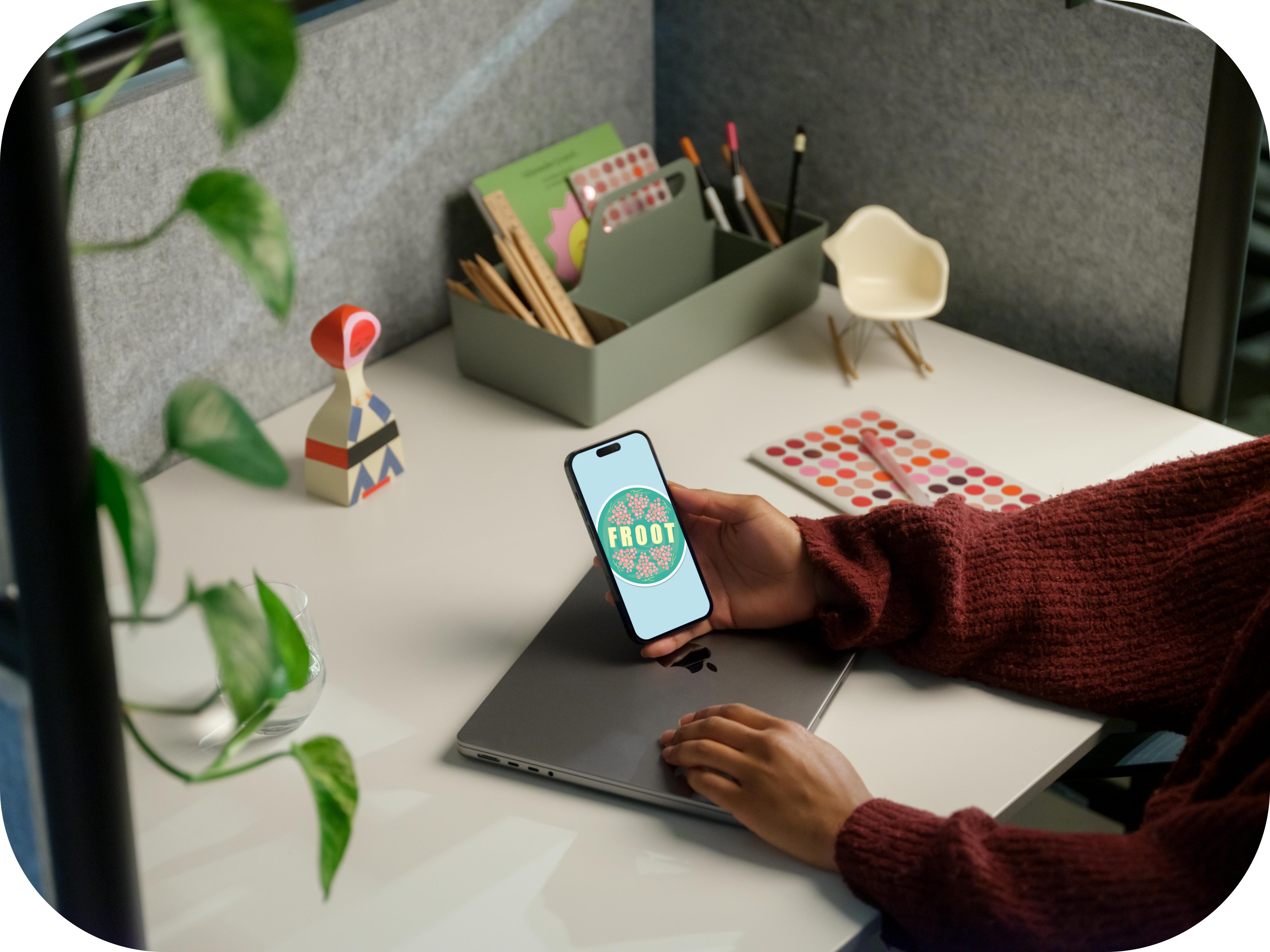
The logo was redesigned to have the feel of apple produce stickers, to associate with fresh produce. Previous notes of the last logo was that it wasn't clear enough as to what the product name was.

NEW LOGO
Market Research: While rebranding Froot, market research was conducted to get an understanding of competitors in the market. I analysed two leading organic product companies. I found that both brands had websites but not apps. The websites contained basic brand and product information but there were also interactive elements. The websites despite containing interesting concepts didn’t have good site navigation and this made it difficult to access the information.
USER FLOW

STYLEGUIDE

PROTOTYPE
FINAL UI


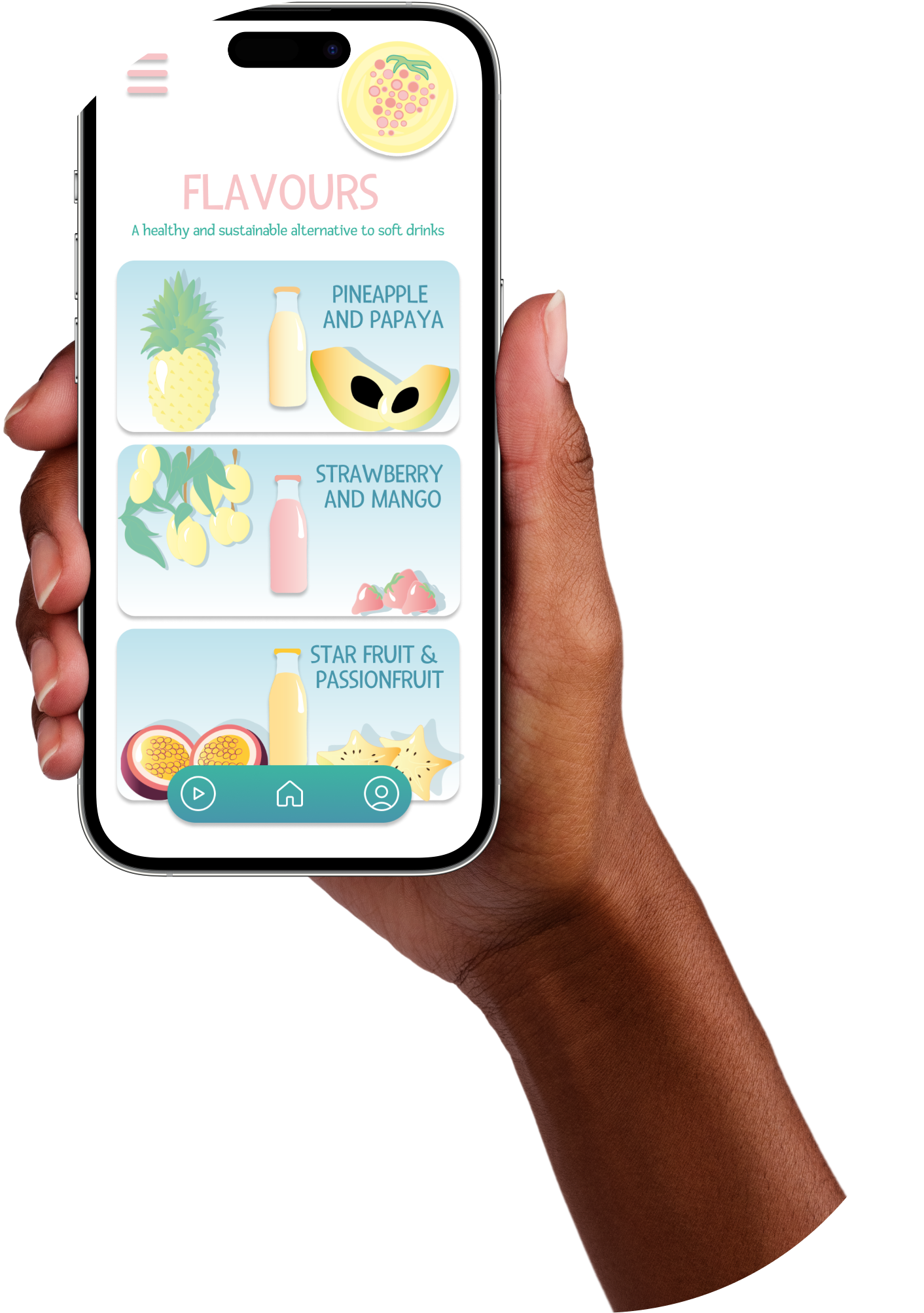
The app is designed to make the froot brand apart of your everday day life, "whether that's after a run or when out having fun." As froot is marketed to 18 to 30 year olds, there is the scoop for using it not only as a healthy juice but also a substitute for soft drinks with alcohol. There are lots of inventive ways of using the product and thats why the recipes tab was created, to keep the product interesting and further reaching.
