
THE PROJECT
CONTEXT
THE PROCESS
RESEARCH
My internship placement was held with Unitic Ltd (2022), which is a start-up company trying to create a solution to tailgating by allowing drivers to communicate with each other through rear LED displays. The company started in 2021 and was still in the middle of finalising their product before it is launched into production.
DURATION: 2 Months
METHODS: Interviews, Card Sorting, Wireframing, Prototyping, AfterEffects
TOOLS: Figma, Illustrator
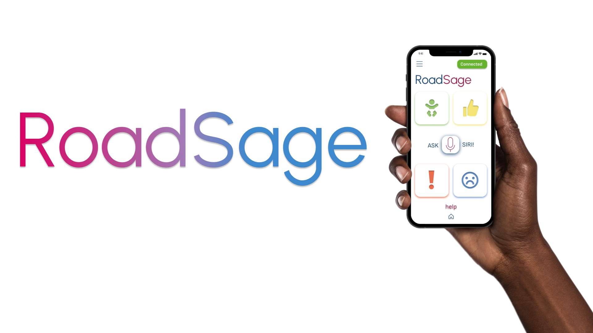
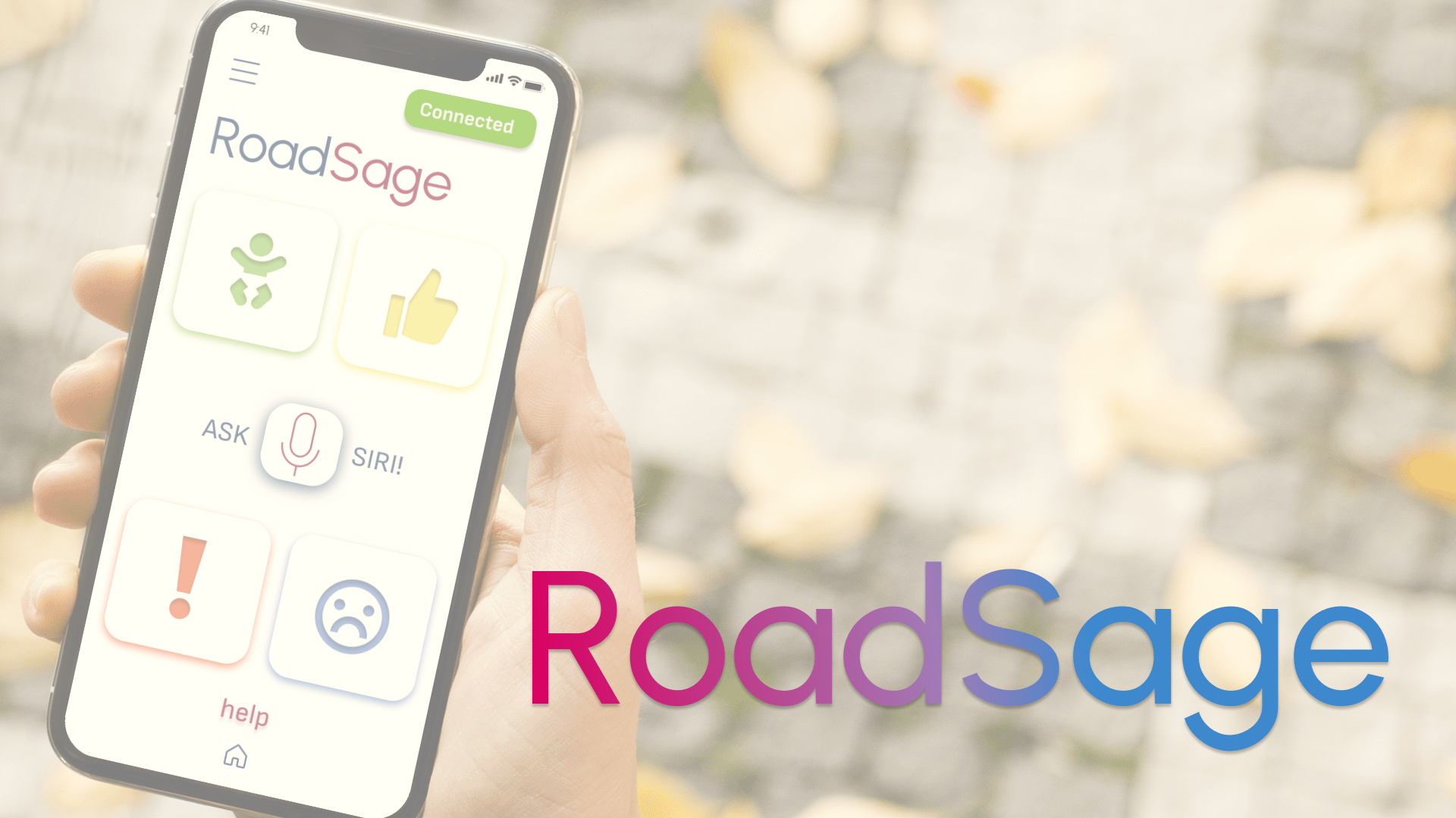
The Roadsage app allows for the user to customise the specific communications on the LED display. This can be customised through the app for both the remote product and app display. The app needs to be intuitive and easy to use safely while driving.

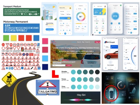
The first step of the project was making a moodboard for the client to make sure that we had a shared vision for the app, and it's aesthetic.
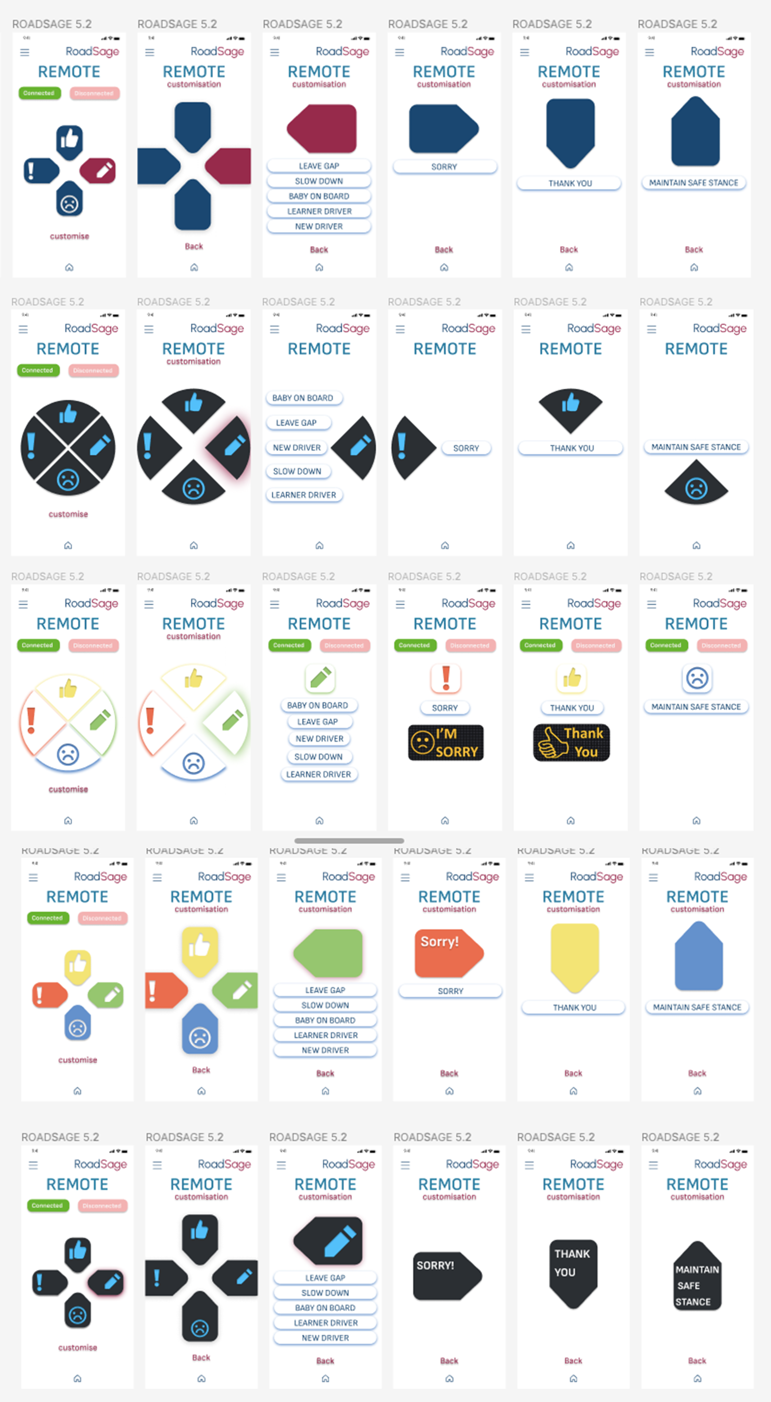
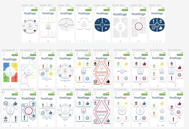
The wireframes below were created by the creators of RoadSage before I joined the project. These were the original basis of what I worked from and expanded upon.
DEFINE
IDEATE
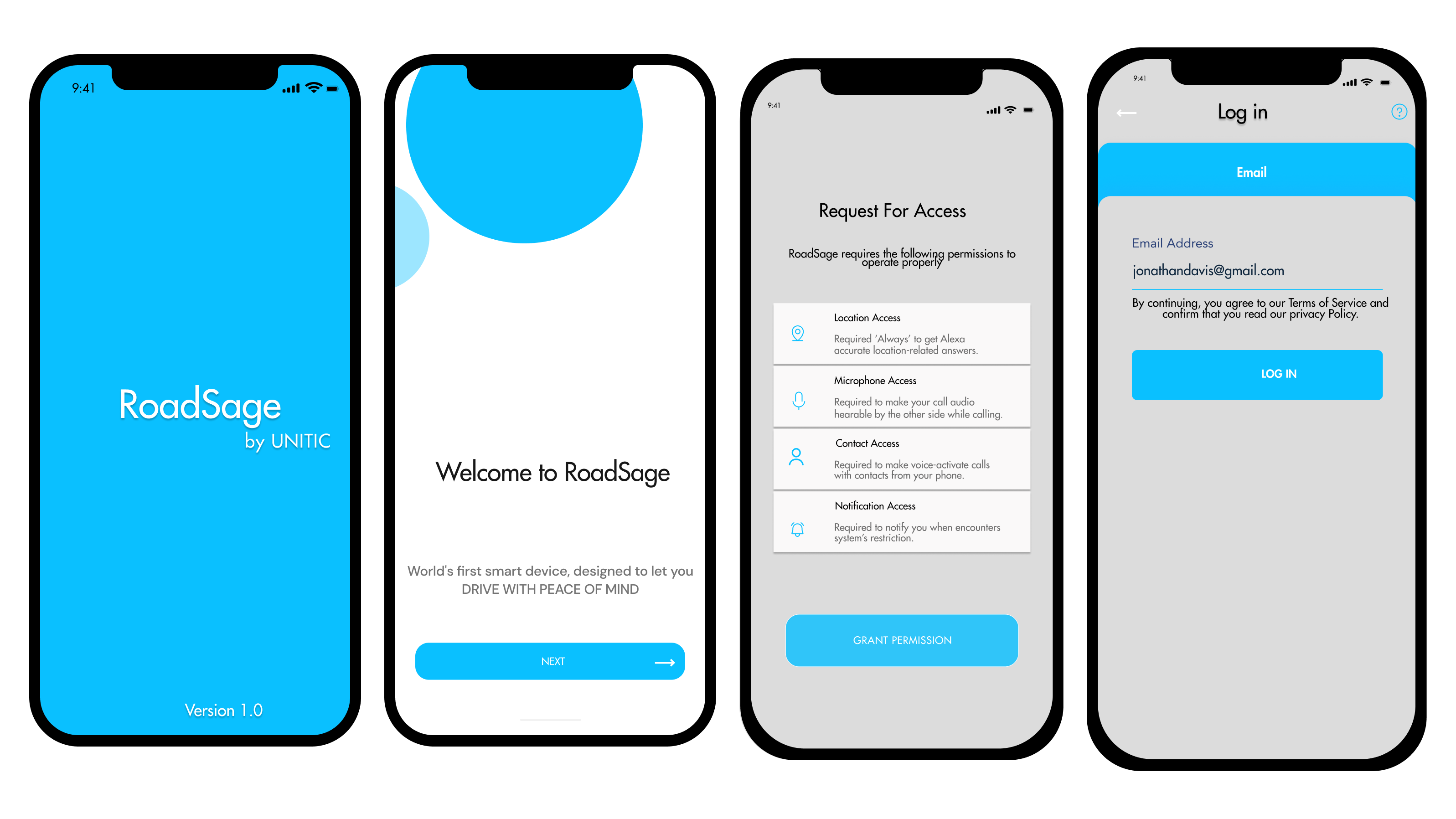
The project brief was to create a well-designed user interface which encapsulate the functional requirements of the RoadSage technology.
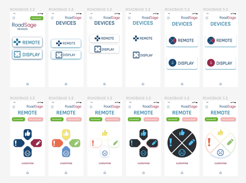
The client wasn't sure of the direction that they wanted to take the RoadSage App, therefore I created multiple solutions for each of the main pages to make sure that I was giving the client exactly what they wanted because the brief was so broad.
USER FLOW

STYLEGUIDE
TEST
FINDINGS
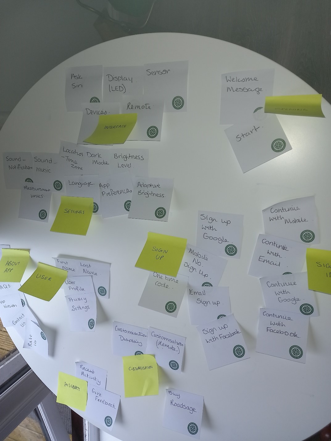
The user research days involved a lot of planning beforehand to make sure the days stayed on schedule. I created some marketing pages to be utilised during the research. Consent forms were distributed before the user testing took place to follow sound ethical practice. I chose card sorting and interviews as they are both beneficial UX research methods that can give plentiful qualitative data.
INTERVIEWS
Interviews were chosen instead of focus groups as you can probe deeper into the thoughts of the user and I felt comfortable in my interviewing skills after carrying out several interviews during other projects.
CARD SORTING
As for card sorting, I chose to use open over closed as closed card sorting can feel more like a test with right and wrong answers, whereas open card sorting tells you more about the user’s way of thinking. Furthermore, I chose to use moderated over unmoderated as I wanted more interaction with the user and understanding their thought process. Lastly, I chose the traditional method of paper card sorting over digital, as it is easier for the user to go through more cards faster.
The findings are presented as part of a user usability report.

FINAL PRODUCT
RETROSPECTIVE
I found this internship experience invaluable and there were many learning opportunities and challenges to overcome. I was able to utilise my user research skills gained from university and put them into practice such as interviews and card sorting. There were communication challenges that came from working at home, but I kept focused and had weekly meeting to discuss ideas and the progress of the project. To conclude I think that this internship has given me good practice to put my skills into a professional setting and deal with the trials of the workplace. I was successful in completing all the goals outlined and received good feedback on the client from the work produced.